twisted moon
Moderator
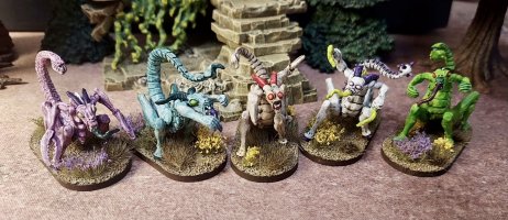
more good work.
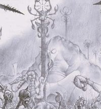
I don’t know that they ever were. I stumbled across them a few years ago, maybe a decade. I am pretty sure they are Adrian Smith’s work. They certainly look like they were done intentionally as a pair, as the swaping of chaos god rivalries between them must be a deliberate choice. But, what they were for? And, when were they done? No idea.I don’t recognise them? Where were they published?
Who is ‘Drew’?Interesting! Certainly looks like Adrian’s early work.
You should suggest to Drew to add the pic to his files for inspiration!
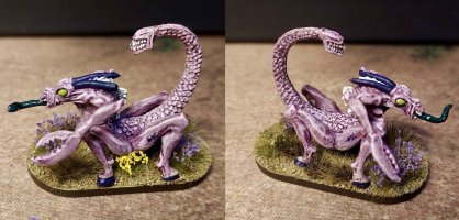
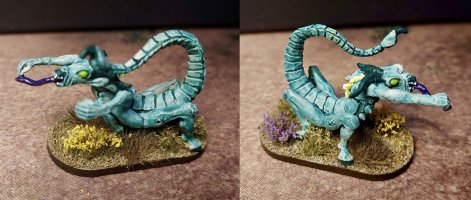
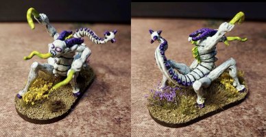
Drew Williams. he owns (or co-owns now) Satyr sculpting studio. used to be the Drew Williams Sculpting studioWho is ‘Drew’?
Ah, very well. I’ve been buying quite a few of his toys. He does excellent work.Drew Williams. he owns (or co-owns now) Satyr sculpting studio. used to be the Drew Williams Sculpting studio
Soz, assumed you knew his name as essentially a one man company.Who is ‘Drew’?
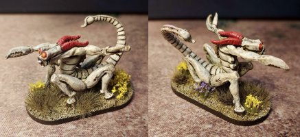
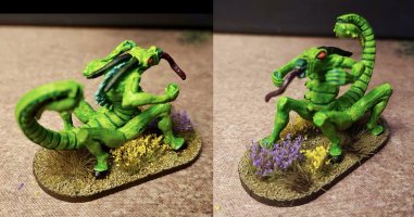
Thanks. I appreciate the vote of confidence. I’m planning more in the new year.Loving your work muchly