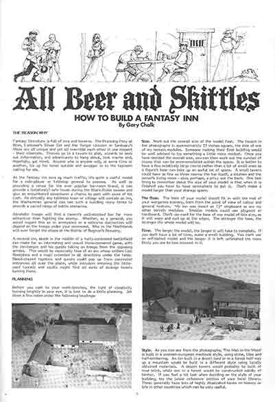
What fonts did GW use in their publications?

Zhu Bajie

Member
Jonas":19qz1efd said:
Hi, I realise this is an old thread. But I have a question about fonts.

What fonts are used for for the stat cards in Warhammer Armies 3rd edition? I was wanting to make my own stat cards for made up units.

Chapter and Section Titles are Feinen Inline

The Unit title, and subsections in the block are Fritz Quadrata Bold, but it is set at about 50% wide
Statblock is Helvetica Bold, again set at about 50% wide - it doesn't seem to be Helvetica Condensed.
Subsection text, and the main book text is Garamond, and the description text at the bottom is Garamond Italic.

Hope that is useful, and It would be great to see your statblock when its done!
 

Jonas

Member
Thanks. I hope to get it done eventually :grin:

I made some work on it, but there is always so much to do.
 

chaz

Member
Zhu Bajie":1ec11rom said:
A Badger":1ec11rom said:
What's the Eavy Metal font?


It's a heavily redrawn Futura Bold Italic - used the lowercase 'y' and pushed the decender onto the baseline, the 'E' is redrawn, and the whole thing is slightly horizontally stretched. Probably Chaz Elliots work?

I'm sure that was the font -can't remember if the color airbrush work was mine -
cheers'
 

chaz

Member
THelppi":13rfb9aq said:
Zhu Bajie":13rfb9aq said:
Might work! Wanted to keep it old-school black on blue, like...

("Counters" and other RT subheads are a 'wide' or squashed Helvetica Black BTW)

Oh man, I had to register here just for this post :grin: (though I would've done it anyways, but I just had to respond to this).

It's actually not Helvetica, though I thought that at first myself as I was identifying the RT fonts and putting up a file with the info. The difference became obvious with the letter Q, as Helvetica as the tail very differently from the ones we see in the book. After a bit of searching (and using a font identification website) I found out it is Univers (Extra Black Extended), though it has been stretched a bit in places. Same goes for the rest of the sans serif fonts in the book, I'm quite sure, though the difference to Helvetica is minuscule.

And in case anyone's interested, the main text font is Caxton (with different weights), and the blackletter used in illustrations (ie. "Imperium approved") and the "Unit Record Sheet" is Fette Gotisch, of which I found one free version that didn't have lower case s, and another that had different kind of s and one webfont that could be downloaded also.

Winner - Caxton - Fette Gotisch and a touch of freehand here and there.


Oh, and:
Hi! I'm Teemu, a newcomer to the Oldhammer community, but an oldhammerer anyways. Started with Rogue Trader in early 90's, mostly played 2nd edition WH40k, didn't play WHFB. Mostly a collector and terrain builder nowdays, but I'm planning on starting an RT campaign at some point.
And sorry for the necromancy of this old thread, I just couldn't let that misidentification slide ;D
 

Zhu Bajie

Member
chaz":3t8nk0bo said:
Zhu Bajie":3t8nk0bo said:
A Badger":3t8nk0bo said:
What's the Eavy Metal font?


It's a heavily redrawn Futura Bold Italic - used the lowercase 'y' and pushed the decender onto the baseline, the 'E' is redrawn, and the whole thing is slightly horizontally stretched. Probably Chaz Elliots work?

I'm sure that was the font -can't remember if the color airbrush work was mine -
cheers'

Thanks for the confirmation Chaz!
 
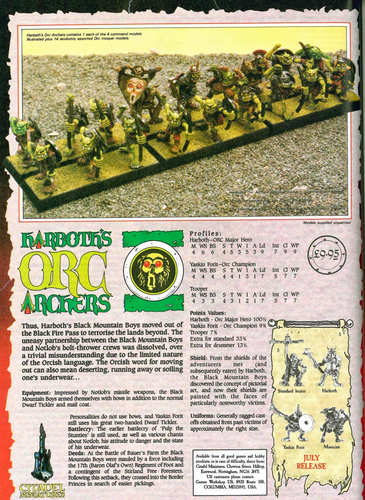
Could anyone ID the font used here (HARBOTH'S ORC ARCHERS)? I've run it through a few apps and come up with nothing.

Harboth's%2BOrc%2BArchers%2BFinal%2BImage.jpg
 

Sleepysod

Member
Looks like it’s probably not a full font set - just a title?

But thanks for sharing - brings back fond memories. Just noticed the command lurking at the back of the unit, that the heroes don’t use bows AND S4 T3! Typo!
 

Zhu Bajie

Member
benjaminography":31ltzfd3 said:
Could anyone ID the font used here (HARBOTH'S ORC ARCHERS)? I've run it through a few apps and come up with nothing.

Harboth's%2BOrc%2BArchers%2BFinal%2BImage.jpg


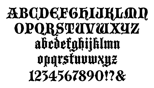
Harboths Orc Archers is a heavily redrawn Blackmoor (probably by Chaz Elliott), the A's are obviously unique, and some effort has gone n to smoothing the curves, making the serifs more 'spikey' and exaggerating certain features, but the general character is the same - note the gap between the bowl and the stem of the R and it's extended leg, the hooks on the O, the break on the inner curve on the S and the stroke on the top of the H etc. etc.

blackmoor.gif


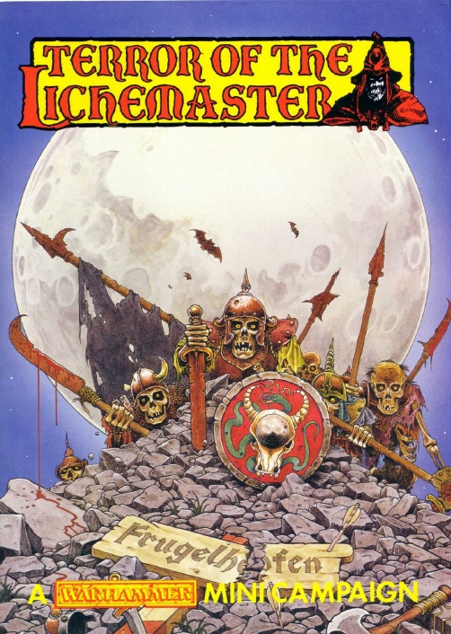
Blackmoor is also used in a clearer form on the Terror of the Lichmaster book

TerrorOfTheLicheMaster.jpg


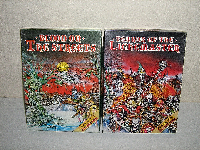
and the Lichmaster and Blood on the Streets re-issues with the Ian Miller covers.

dpyj3Vs.jpg


and in the (3rd) Citadel Compendium

citcomp3005-02.jpg


and also heavily redrawn on the unholy awesomeness that is the Zombie Dragon box.

IMG_4611.JPG


and probably one or two other places as well!
 

begleysm

Member
Hey all,

I know this is an old thread but it is incredibly useful and informative! Thanks especially to Zhu Bajie & THelppi.

I run a site called the Tabletop Campaign Repository. It's a 100% free, no ad, community resource for hosting homebrew campaigns, scenarios, rules, & resources for supporting narrative play in tabletop miniature war games. All authors are credited and all relevant sites/blogs/channels/profiles are linked. Everywhere practical, author permission is obtained. I've tried to make it agnostic to game system & edition. Material is "tagged" by game system and edition.

Anyhow, the real reason I'm posting here is because I combed this thread and compiled a spreadsheet, font files, & example images of all of the fonts identified here! You can take a look at the download I created over at TCRepo here: https://tcrepo.com/downloads/warhammer-fonts/.

My goal was to make it simple for homebrewers to find the font they need and use it for their Oldhammer creations! If anyone would like to contribute more information, I'd love to expand the collection. Just shoot me an email at campaignrepo@gmail.com.
 
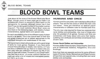
I hope 2nd edition Blood Bowl counts as Oldhammer? Apologies if not... it's certainly 'Oldbowl'

Does anyone know the font used for the 'Star Players' and 'Companion' supplements that came with the 2nd edition. (not the titles, but the main font used for the text). From reading these posts (fascinating stuff, BTW), it appears to be close to the Univers extra bold, but, not being an expert, I'm only really guessing.
 

Attachments

  • Screen Shot 2022-11-25 at 11.15.32.png
    Screen Shot 2022-11-25 at 11.15.32.png
    241.5 KB · Views: 234
Pleased to hear it! I was glad to find this thread, I thought I was the only one who thought about this stuff. It's nice to know I'm not the only one!!!
 

Zhu Bajie

Member
The chapter title in the header looks like Copperplate Gothic.
I think the body text and sub-heads are various weights of Helvetica or Univers, but I don't have BB2e and the text image is a bit low resolution. The easiest give-away to check is the bowl of the lowercase a and the tail of the lowercase y.

main-qimg-168d65c952f4bef2d1dc5f6095099200
 
Thanks so much for such a quick reply. Having checked the lowercase letters you mentioned, I can confirm it's Univers. I noticed it mentioned in an earlier post as they seemed to have used it for other publications.
Mystery solved.
Thanks again.
 

Zhu Bajie

Member
No problem! Checked my copy of BB1e and can confirm the body text is set in Univers there as well. Headings are set in Princetown.
 

irwit

Member
Hi all,

Digging up one of the greatest forum threads Ive ever seen !


ANy ideas what the font used for Dark Millennium is? I think this was used for a few of the title cards on second edition?

 
Back
Top