You are using an out of date browser. It may not display this or other websites correctly.
You should upgrade or use an alternative browser.
You should upgrade or use an alternative browser.
What fonts did GW use in their publications?
- Thread starter axiom
- Start date
Zhu Bajie
Baron
Let's start here:
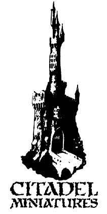
This is "Stonehenge" published by Graphic Products Corporation in their Formatt series of cut out lettering, used in paste-up before graphic design became something people just do on computers. Anyone have any sheets, let me know I'd like to get ahold of some.
Citadel aren't the only fantasy brand to use the font, it appears on TSR D&D products, Palladium Games RPG, Heritage Miniatures "Dungeon Dwellers" and many others. In GW publications, it's also used as the 1st and 2nd Edition Warhammer logos, and as each of the book headings in 2nd.
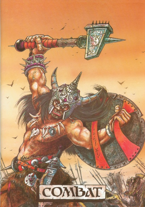
3rd edition logo is very heavily based on it, but it isn't the same thing really.
So far there have been two digital revivals of Stonehenge, both distributed for free:
1) Moria Citadel by Russ Herschler of Dragonfang - online gaming supplies retailer and archive of many an adventure sheet. Russ was kind enough to point me in the right direction for the origin of his font. This is the one I used on the logo up there at the top of the site, and so is an Offical Oldhammer™ Approved Product
2) Satans Minions by Mickey Rossi, which isn't quite as nice IMHO.

This is "Stonehenge" published by Graphic Products Corporation in their Formatt series of cut out lettering, used in paste-up before graphic design became something people just do on computers. Anyone have any sheets, let me know I'd like to get ahold of some.
Citadel aren't the only fantasy brand to use the font, it appears on TSR D&D products, Palladium Games RPG, Heritage Miniatures "Dungeon Dwellers" and many others. In GW publications, it's also used as the 1st and 2nd Edition Warhammer logos, and as each of the book headings in 2nd.

3rd edition logo is very heavily based on it, but it isn't the same thing really.
So far there have been two digital revivals of Stonehenge, both distributed for free:
1) Moria Citadel by Russ Herschler of Dragonfang - online gaming supplies retailer and archive of many an adventure sheet. Russ was kind enough to point me in the right direction for the origin of his font. This is the one I used on the logo up there at the top of the site, and so is an Offical Oldhammer™ Approved Product
2) Satans Minions by Mickey Rossi, which isn't quite as nice IMHO.
Nico
Vassal
Zhu Bajie":30q5n2c3 said:1) Moria Citadel by Russ Herschler of Dragonfang - online gaming supplies retailer and archive of many an adventure sheet. Russ was kind enough to point me in the right direction for the origin of his font. This is the one I used on the logo up there at the top of the site, and so is an Offical Oldhammer™ Approved Product
Thany you Zhu !
Zhu Bajie
Baron
phreedh":1740kkjh said:Zheers Zhu! I've been using Casablanca Antique as a "counts as" proxy... =)
Good call Phreed. Casablanca Antique is font I used for "In Battle There is No Law" up there on the logo, and as headings on the Oldhammer blog ans the Oldhammer Wiki. Needless to say so is also an Offical Oldhammer™ Approved Product (I wonder how long I can get away with that gag).
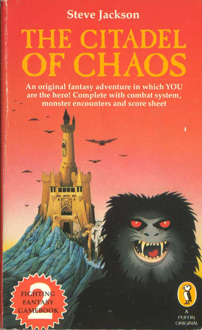
It has a long and venerable history in GW - it is the main heading font in Warhammer Fantasy Roleplay 1st Edition, Realm of Chaos (StD), and steadily became the defacto-standard Warhammer font used on packaging throughout the 90s and 10s. As a typeface it has an interesting history, it's actually a knock-off of Caslon Antique...
... but it appears that GW don't use Caslon, but Casablanca. It's other uses outside are wide and varied, it's the main font used by the seminal 80s goth band, Sisters of Mercy, and the original cover for Fighting Fantasy Citadel of Chaos (coincidence?)

Zhu Bajie
Baron
Yep, I did some research on that a while ago it is not Courier,

The early Warhammer font (1st Ed. 2nd Ed and Compendiums, as above) is a Xerox pinwheel type called "Cubic PC" check the second sample:
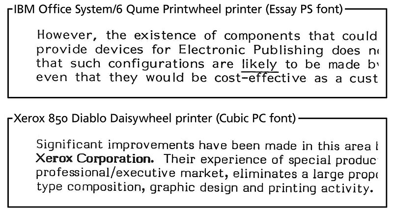
But it has never been digitized as far as I know. SV BASIC MANUAL by Johan Winge is a TTF revival of a different version of Cubic - and he's working on a new one, which is much cleaner, but he hasn't released it yet. Winges version(s) don't have the same proportions as the GW / Xerox - which have much wider caps, and the lowercase i, l, aren't the same at all - it might be enough to give a similar feel, but not quite enough to create forgeries of rare Citadel flyers and sell them on eBay for massive profits.
The headings in have been digitized as Egyptienne. Actually I don't know what the original letraset might have been.

http://www.youworkforthem.com/font/T2512/egyptienne
You can see I used these 2 in combination here:


The early Warhammer font (1st Ed. 2nd Ed and Compendiums, as above) is a Xerox pinwheel type called "Cubic PC" check the second sample:

But it has never been digitized as far as I know. SV BASIC MANUAL by Johan Winge is a TTF revival of a different version of Cubic - and he's working on a new one, which is much cleaner, but he hasn't released it yet. Winges version(s) don't have the same proportions as the GW / Xerox - which have much wider caps, and the lowercase i, l, aren't the same at all - it might be enough to give a similar feel, but not quite enough to create forgeries of rare Citadel flyers and sell them on eBay for massive profits.
The headings in have been digitized as Egyptienne. Actually I don't know what the original letraset might have been.

http://www.youworkforthem.com/font/T2512/egyptienne
You can see I used these 2 in combination here:

VanLoon
Vassal
Zhu Bajie":2noi4o95 said:... not quite enough to create forgeries of rare Citadel flyers and sell them on eBay for massive profits...
Thanks for the extra information, I found it very interesting.
phreedh
Baron
What the hell happened to that thing?! I remember being close to winning over Thants...Zhu Bajie":2o8e393l said:
Zhu Bajie
Baron
Phreed - I think we're still waiting for you to put your turn in! Lol! If there's interest we can resurrect it.
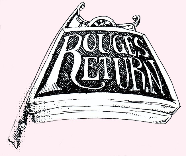
Back on topic, the main page-chapter headings in Rogue Trader are ITC Serif Gothic
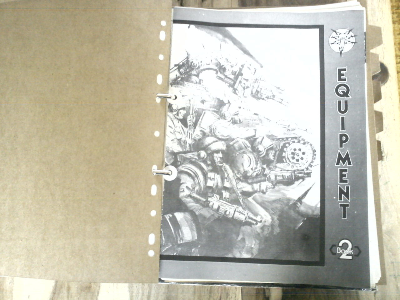
Which is the same font as used in 1st /2nd Talisman
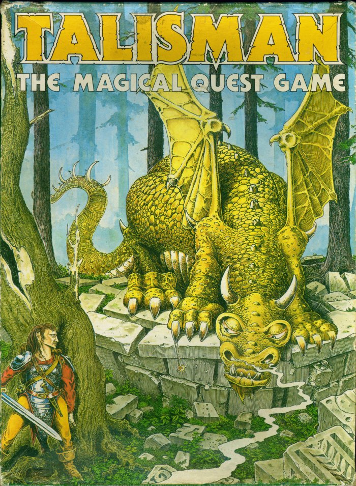
and laso appeared on He-Man toy packaging in the 80s.
Note that very cool variant rounded "E" on the Talisman box. Seriously I've got tonnes of notes on this stuff in half written blog-posts...
Back on topic, the main page-chapter headings in Rogue Trader are ITC Serif Gothic

Which is the same font as used in 1st /2nd Talisman

and laso appeared on He-Man toy packaging in the 80s.
Note that very cool variant rounded "E" on the Talisman box. Seriously I've got tonnes of notes on this stuff in half written blog-posts...
phreedh
Baron
A nerd! Get him!!!Zhu Bajie":2ijj7szg said:Seriously I've got tonnes of notes on this stuff in half written blog-posts...
Oh... Oh, wait.
Never mind. =)
Nice additions Zhu! Your knowledge in this is impressive, but not unexpected. =)
Zhu Bajie
Baron
You should see the pulling power that an encyclopedic knowledge of 1980s gaming typography has on the ladies. Mine gott, it's like The Axe Effect.
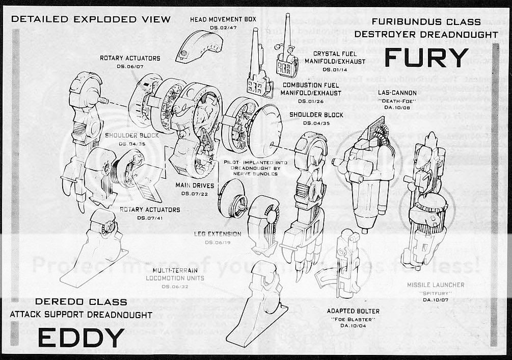
Bank Gothic

Buy here: http://www.myfonts.com/fonts/bitstream/bank-gothic/
Oh, and I'd love to see anything people put together using this stuff...
With apologies to Barney Bubbles and the Ford Motor Company:
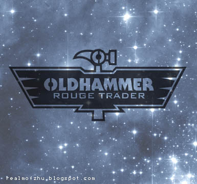

Bank Gothic

Buy here: http://www.myfonts.com/fonts/bitstream/bank-gothic/
Oh, and I'd love to see anything people put together using this stuff...
With apologies to Barney Bubbles and the Ford Motor Company:

Magos Explorator
Vassal
Nice one, Zhu--although not sure if 'rouge' was intentional there!
Captain Crooks
Baron
Subtly change the colour of 'rouge' to red 


