Looking for Arty advice

Good evening,

Im looking for some advice on how Gary Chalk went about colouring the maps in the old dungeon planner boxes, are there any arty folk here who know this stuff?
Im using these in a role playing game im running .
Big blocks of flat colour is beyond my current skills
Thanks

20261027_193453.jpg
 
If I had to guess I might suspect those maps are built up from layers of acetate (so an alcohol-based ink for the black) prior to photographic reproduction, that would explain some of the colour separation. Alternatively if done on one sheet I guess maybe waterproof Indian Ink and then water colours applied better thank I could! The colour blocking isn't totally uniform and does intentionally fade/blend in a few places, but is remarkably uniform as you say.

It looks like he's still active on Twitter/X - https://x.com/garychalkpics, interestingly given we're mulling maps - he's re-drawing one of the Lone Wolf maps in this post
To view this content we will need your consent to set third party cookies.
For more detailed information, see our cookies page.
although from the photo I can't be sure exactly what paints (probably Gouache but maybe Acrylic) and inks he's using in that one, but it's a different style anyway. Anyhow I was going to say you could ask him about them if you're on Twitter/X info one here has some better knowledge.
 
There are quite a few ways of achieving what Gary did with that map so I wouldn't be able to narrow it down particularly. However if you'd like to create a similar effect with modern tools and aren't particularly arty yourself then Alcohol markers are great at providing that relatively flat but blend -able colour.

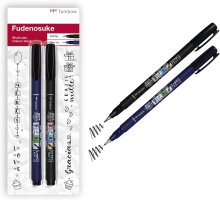
Couple alcohol markers with a black Brush/tipped pen such as the one's Tombow makes to get those gradations in line width and you'd be well on your way. :)
 

Attachments

  • Tombow.jpg
    Tombow.jpg
    137.3 KB · Views: 3
Back
Top