You are using an out of date browser. It may not display this or other websites correctly.
You should upgrade or use an alternative browser.
You should upgrade or use an alternative browser.
John Blanche?
- Thread starter The Serene Badger
- Start date
Fighelm
Baron
As Eric noted in that Awesome Lies blog interview, Rick's own words:yeah, that photo is of the Xerox one, not the Rank Xerox one. that was one hell of a pricey machine at the time. Who knew they had THAT kinda money. sure, it was a 1979/1980 machine but.. Optional Harddrives up to 10MB! at that stage! dual Floppy drives...
'Everything for the first draft was written on the Rank Xerox WP (Hal would have sent in typescript hard copy which I would have transferred manually). I imagine it would all have had to have been completely retyped at some point into whatever format was needed for the Amstrad PCWs with which we were re-equipped when we moved to Low Pavement. I can’t think that we would have been able to make a transfer between the Xerox WP system and whatever we were using for the Amstrads...''
Brother Meredith
Lord
Hey! That’s where I read they used PCWs! Knew I hadn’t dreamt it… 😅
dieselmonkey
Lord
@dieselmonkey , 1984 before your time?
99% sure it was a Xerox machine. Couldn't tell you the exact model though.
*EDIT* D'oh! Didn't see the replies before posting, it's already solved!
Fighelm
Baron
Back on track, here, with the John Blanche commemorative comments... Two copies of David Days 'A Tolkien Bestiary' up for sale in Oxfam.
Here:
& here:
Here:
& here:
Michael Stockin
Lord
Am I alone in not being that struck with his work?
Art is subjective and if people like some art and not others that is of course totes fine, but I can't be the only one who is not that keen on his art?
Not saying it is bad or he was a bell, just curious?
Art is subjective and if people like some art and not others that is of course totes fine, but I can't be the only one who is not that keen on his art?
Not saying it is bad or he was a bell, just curious?
Fighelm
Baron
Yes it is, you are quite right. You are on about John Blanche, yes? We follow a hobby which is heavily nostalgic, and here are all adherents to the cult of Oldhammer, all ages & backgrounds worshipping at same alter.Art is subjective and if people like some art and not others
He was intertwined with the Citadel/GW element of the oldhammer story from the start. From me, buying minis, his was the art on the back of blisters, in the early rulebooks etc, stuff in WD, 'Eavy Metal, etc. They were my first real entry and hook into the hobby before buying a rule book, GM' ing etc. Not everyone likes everything, some don't like Gary Chalks work, but that's OK - each to their own. It can be a generational thing as well. I'm not overly keen on the later stuff, more cartoon stuff (but I ike Bonners work!) but recognise that there was/is different styles in illustration.
I agree with dieselmonkey: https://forum.oldhammer.org/threads/citadel-blister-card-artwork.28009/
Brother Meredith
Lord
Can you articulate what do don’t like about his artwork?
Is there an early GW artist that you prefer over Blanche?
Is there a certain period or style of his artwork that you prefer over others or just the whole oeuvre?
For me I recall finding his sketchy b&w illustrations in 2ed 40k somewhat jarring, but have come to appreciate the context of their production a little more (put together at a quick turnaround due to a diminished art team) and now they are considered really iconic.
His early fantasy paintings are really something else, the illustrations for The Tolkien Bestiary really captured my imagination when I first encountered them, can loose myself staring at those big battle scenes.
I think my first conscious encounter of his work was the Sorcery books, the linework felt some much more detailed and stylised than the others I had read in the FF range and those big adventures were formative for my fantasy imagination.
lenihan
Moderator
I suppose I'd wonder which part of his work you mean; there's a definite mark of his hand throughout his whole career, but at the same time his early work is much more closely connected with the fairytale art of, say, Aubrey Beardsley than the later 'grimdark' gothic work was. I'm not into grimdark, but his early stuff is beautiful. I'm lucky enough to have the catalogue of the Ansell's "Harry the Hammer and Friends" exhibition, as well as a copy of Ratspike, so I suppose that does give me a bit of a retrospective on his style.Am I alone in not being that struck with his work?
Art is subjective and if people like some art and not others that is of course totes fine, but I can't be the only one who is not that keen on his art?
Not saying it is bad or he was a bell, just curious?
lenihan
Moderator
I've just been looking at the illustrations he did for the Sorcery Spell Book. Great fun.I think my first conscious encounter of his work was the Sorcery books, the linework felt some much more detailed and stylised than the others I had read in the FF range and those big adventures were formative for my fantasy imagination.
Fighelm
Baron
As above, & some of his stuff does have a sniff of Mervyn Peakes art (tale of the ancient Mariner, the Titus groan stuff, the Dickens novels, etc) - in style and technique, but that could be levelled at his mate Ian Miller! See attached Peake cover for Grims fairytales. Like Peake, durer and Goya were influences, and John notef himself in that grimdark film, it was always history and (northern) historical references...But he set the scene, the little motifs, things like sigils and banners, etc, all round inventiveness and pure fantasy!
I love all the early stuff of all of them - Blanche, Dave Andrews, & Tony Ackland, stylised, rough illustration & heavy pen & ink. The pages from the compendiums, the first Citadel Journals. Like I said just my preference and age, and what I was into back then. Chalk was favourite, liked Tony Hough for detailing, and Paul Bonner for just capturing character and talented artistry.
I love all the early stuff of all of them - Blanche, Dave Andrews, & Tony Ackland, stylised, rough illustration & heavy pen & ink. The pages from the compendiums, the first Citadel Journals. Like I said just my preference and age, and what I was into back then. Chalk was favourite, liked Tony Hough for detailing, and Paul Bonner for just capturing character and talented artistry.
Attachments

Last edited:
Fimm McCool
Lord
As Lenihan says, there were definite periods. I love the high detail of McDeath, Khare and Amazonia Gothique. I'm not a fan of the 'grimdark' and have never liked his style of miniature painting. Tony Ackland, Gary Chalk, John Sibbick, Ed Org, Dave Gallagher, Wayne England, Tony Hough, Carl Critchlow, Paul Bonner and Mark Gibbons are all GW artists whose work I prefer over post-1998 Blanche.
Michael Stockin
Lord
Can you articulate what do don’t like about his artwork?
Is there an early GW artist that you prefer over Blanche?
Is there a certain period or style of his artwork that you prefer over others or just the whole oeuvre?
I don't mind his feel or the landscapes, but pretty much every time he does anatomy I find it jarring, things are never in proportion.
Hands are too big, joints in the wrong place, body parts too long/short/thin etc.
Heads are the size of knees etc.
He has a style that I don't mind, just I don't like the proportions on the people he draws, they are not anatomically correct and that takes away for me.
I am not really sure who was around at the same time, Carl Critchlow I like, though he was very much a different style.
I loved Paul Bonner but he was later?
Those 2 are the only ones I know I liked, liked enough that their names are locked into my head.
I think I liked Les Edwards, I am off now to see who I liked.
The jury is out on Ian Scrathy Miller.
Eric
Administrator
I can second that - I remember thinking "what the heck" at the time, having been used to all the art styles that came before they seemed really rough and ready and I wasn't a fan. Whilst they are not favourites or anything now I enjoy them more now.For me I recall finding his sketchy b&w illustrations in 2ed 40k somewhat jarring, but have come to appreciate the context of their production a little more (put together at a quick turnaround due to a diminished art team) and now they are considered really iconic.
Well we all know I'm a Miller fan-boy ... although I can see how a lot of his weirder and really freaky stuff is probably not to taste his bits of pure fantasy art I feel are sublime and I love the minute pen work. I could stare at those all day. Probably why I also like John's earlier line+wash type work.The jury is out on Ian Scrathy Miller.
I've often felt that way about some of the pieces - so the classic 40K 2nd edition cover art whilst I grant iconic now isn't a piece that works for me - I never felt the central marine "looked quite right". I'm not sure that seems true in all his work, but the "not quite right" is a theme that runs I think through quite a lot of GW artists at various points, bits of "off" perspective and so forth. Which feels a bit mean of me to say given I can't draw for toffee, but I shall sit and be a keyboard critic for a moment ...I don't mind his feel or the landscapes, but pretty much every time he does anatomy I find it jarring, things are never in proportion.
Hands are too big, joints in the wrong place, body parts too long/short/thin etc.
Generally however I've not found to too jarring in John's work. Quite a lot of his earlier work, especially the more femme characters are I assume intentionally somewhat distorted. However I can see what you mean here and there looking specifically for it in Ratspike now, so Dark of Harkness for instance I guess these too look a little wonky if you stare for too long:

The composition in Across the Styx also always threw me off. Much of it (in general not just John) however I put down to doing art specifically for box/book covers and speaking of book covers ... someone who has done countless covers.
Les did some classic bits for GW, dark future pieces, the LOTD cover, HeroQuest of course. Depending on the gamma of the printing of the Confrontation image (red armoured marine blasting the skavvies) the poor marine can look like he's had his head cut out and stuck on (the Les Edwards art book is a good (bad?) example of this). I like Les' art and have one of his little Goblin faces framed on the back of my office door.I think I liked Les Edwards
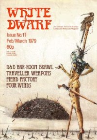
Paul did plenty in what I think of as the golden age. I vividly remember all his illustrations in Squats section in WD 111. Lovely stuff.I loved Paul Bonner but he was later?
Fighelm
Baron
It's all gone a bit 'Marmite...' 
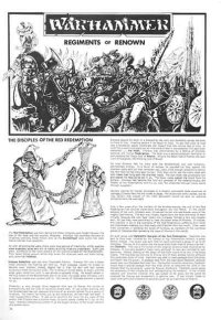
Whether you like the art, indifferent or positively turned off by it, he was responsible for some incredible pieces. The WD covers, box sets and regiments.
On proportions, well... good fishing. You can say figuratively, yes, but also he stylised stuff and made a picture dynamic, set a scene. In that sense he is no different from, say, Ralph Steadman, Rodney Matthews, Boris Vallejo, Frazetta, Aubrey Beardsley or Picasso. ..or the fact that the miniatures they were selling weren't anatomically - proportionally- correct.
He gave us a continuous thread, a style legacy from start to the end.
Attachments

Fighelm
Baron
Yes, totally.... but also on occasion grimdark ie 'the gothick and the eldritch' was a compilation of some of his stuff.I always felt Jes Goodwin's art was undervalued compared to his sculpting....
Brother Meredith
Lord
I wouldn’t say that! https://ebay.io/m/45CvAb 😅I always felt Jes Goodwin's art was undervalued compared to his sculpting....
He did produce less artwork than John, but his concept work and world building are certainly on a par!
ManicMan
Lord
looks like most of his more modern concert sketches for 40K then his final arts (not saying concept sketches can't be equally as good as final art, or final art can't be used for concept.. mostly what it's about).. and that's just priced cause of what it is, more then who it is.. if you know what I mean ^_^
do people have to always misunderstand what a gothic style in art is though?.. maybe there is gothic style in there but you would think there would be on the cover.. Gothic has amazing amount of light, over with hard shadows but large open spaces, large windows to let in alot of light...
but this is side tracking ^_^;
willlucv
Vassal
It is completely down to individual preference. Simon Bisley and the entire wave of artists he influenced never worried overmuch about proportion of anatomical correctness (or in fact continuity if I'm honest). In the fantasy genre Josh Kirby also took this approach to extremes especially for his Discworld covers (which I adore). When I was reading 2000AD in the early 90s they used to really go to town on this sort of thing and I absolutely loved it (pictured below Greg Staples's Dredd)I don't mind his feel or the landscapes, but pretty much every time he does anatomy I find it jarring, things are never in proportion.
Hands are too big, joints in the wrong place, body parts too long/short/thin etc.
Heads are the size of knees etc.
He has a style that I don't mind, just I don't like the proportions on the people he draws, they are not anatomically correct and that takes away for me.
I am not really sure who was around at the same time, Carl Critchlow I like, though he was very much a different style.
I loved Paul Bonner but he was later?
Those 2 are the only ones I know I liked, liked enough that their names are locked into my head.
I think I liked Les Edwards, I am off now to see who I liked.
The jury is out on Ian Scrathy Miller.

Carl Critchlow also had a very comics influenced style (again he was obviously an actual comic book artist).
I mention this sort of thing because I think it did influence the entire design aesthetic of Citadel Miniatures which tended to have exaggerated features, oversized heads, hands, weapons etc, something they've only very recently started to move away from.
Paul Bonner was around since at least the mid-80s, he did lots of art, especially the Orcs and Goblins in Titan-The Fighting Fantasy World which came out in 1986.
One of my favourite Les Edwards pieces is the internal painting in the Prodigy album Music for the Jilted Generation. I'm very much from the old rave scene and can still remember when the government and police were really looking to crack down on raves. Incidentally it was years before I realised it was by the same artist who did all that cool art for Games Workshop.

I'm a massive Ian Miller fan, I loved all that stuff he did for the Rogue Trader book and for Realms of Chaos, really brave decision to allow such a wide range of artistic visions.
TL