
Old Man Moans Again.

Does anyone paint flat areas with shading and highlighting in a way that represents how light works, or is it all edge highlighting these days?

See some comparisons:
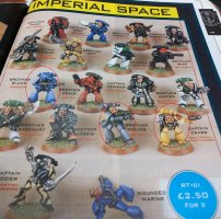
osh.jpg

Nicely blended and the big flat areas that would obviously catch the light are catching the light, going darker as we go around the legs and away from the light source into shadow.

eh2.jpg

Dramatic for sure, but not really how light works?

I can see the visual appeal of edge highlights, and they are no doubt quicker than blending and shading, but I just don’t think it looks realistic, maybe that is my bias for world building and buy in rather than gaming?

Maybe I am just grumping again?


PS: I am comparing techniques rather than saying my blending and shading is better than other peoples edge highlighting.
 
ugh.. that edge highlighting looks to me..

While I find it tricky to work out light source as.. the figure can be moved, I normally work out a rough life direction and try to do something based on that.

of course, SOME of the lighting in that picture of the original classics is due to the light when taking the photo, But still better to highlight what makes sense then that all round edge bordering.

though my highlighting isn't great at all so, what do I know ^_^
 
I try to do what seems to be called "volumetric painting" on every mini these days (see here) - probably not spending as much time on it as I should, but I have not a lot of painting time at the moment.

I try not to go overboard with edge highlighting, though I do find it a useful tool with old sculpts to accentuate details and edges which can sometimes be a bit muddy/vague due to old/worn sculpts or not very sharp castings in the first place.

I take photos all my minis with my main light above and to the right of the mini, and since that's how basically everybody (but my wife and I) will see them I paint the volumes and edge highlighting in accordance with that being where the light is coming from so that it all makes sense.

All over edge highlighting is definitely -a- look, but it's not one that I enjoy painting... and I think it can burn new painters out to try and emulate it, as the brush control isn't something that's necessarily easily picked up at the beginning of a painting journey.
 
I'm not good enough of a painter to get lights and shadows as they should be. This is a fact that I've accepted and thus I just slap colours on minis when I feel like doing so and that's good enough for me. :) Edge highlighting has its merits; it's easily readable from distance and makes minis "pop" more.
Personally I've got nothing against it, and I guess that's somewhat what I do with my minis,
 
with shading and highlighting in a way that represents how light works
Well I'd not go so far as to say I paint properly for how light "works". I do take some liberties, but that's the general principle I aim for. Obviously you have to push things a bit to get the contrast higher so the miniatures have presence an "pop" as they like to say. I do use edge highlighting, but generally strong edge highlights are reserved for sensible places where the light might be, although I might lighten another edge to provide some contrast - much as you might "black line" to provide contrast between two areas. I always think I never push my highlights far enough.

Not a huge fan of the edge highlighting as demonstrated on that marine, I much prefer a softer look than that. Gimme old school anyday (although if you look at the Golden Demon entries they are all much smoother highlighting.
 
I try to do highlighting and shadows on my minis, with some edge highlighting when it seems appropriate. Honestly when painting say WW2 soldiers or 40K Imperial Guardsmen, I do drybrushed highlights, a wash to enhance shadows and for toning, and the only part that might get an edge highlight is a helmet rim or the flap on a leather pistol holster. On a Space Marine I do sharp edge highlights where it seems the light would catch, and I emphasize such to try to "break out" bits of the helmet, shoulder pads, and greaves to try and give extra definition to the shapes.
 
Back
Top