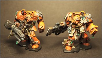
Awful Blood Angel Terminators

clownshoe

Member
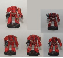
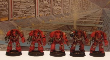
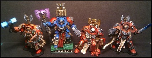
I finished these last night, i thought they looked good in the flesh, then i photographed them and they look bloody awful in my opinion. Is it just me? The colour looks washed out and the shade just looks dirty. They were supposed to be a test scheme for the new space hulk set i bought - pre shade undercoat, then scarlet red base, hull red shade and orange highlights (airbrush). There is a little weathering/battle damage and these "should" be pretty much done.. Now i am not sure.. What do you guys think?
 

Attachments

  • bad angels.JPG
    bad angels.JPG
    213.7 KB · Views: 2,925

Snickit

Member
Could try an AP Soft Tone QS Ink (not the dip). Possibly needs a little more detailing on the helmet as the face draws the eye.

Overall, when I paint something I'm my own worst critic, I think that may be what's happening here, do a tiny bit more work on them, put them aside to dry and come back to them tomorrow with a fresh eye.
 
Psieker's Blood Angel thread http://forum.oldhammer.org.uk/viewtopic.php?f=8&t=2983was a great help to me.

Here's a WIP of mine
termietest_zps89585739.jpg

The orange doesn't show up so well in my pics, he's not so red in person.

White undercoat followed by evil sunz scarlet base, then a watered down devlan mud (agrax earthshade) wash, re apply evil sunz scarlet and then blazing ( troll slayer) orange highlights is how I've done it- I think Psieker put's some yellow into his highlights?
 

Asslessman

Member
They don't look bad at all but the red is a little "flat" maybe... I woul suggest throwing a little agrax eathshade wash in the recesses to deepen the colour and then highlight the red via maohiston through scarlet red with a final highlight of cadmiuùm red (Prince august) on the edges (with why not a dot of orange on some raised spots) to lake everything "pop" a bit more.

It's what I did for those guys just so you see if that's what you want :

SS852181.JPG
 

Protist

Member
I'd agree with Asslessman, at least in adding some definition to the models with black or brown lining, or using a wash into the recesses. The advice on highlighting a bit more is also good - though the choice of tone is your's to make. Here's some blood angels I did using (iirc) vomit brown mid highlight with a yellow/orange final highlight

large_group.jpg

small_group_2.jpg
 

Protist

Member
Apologies for double posting but I meant to add that you should never rely on airbrushing for a final highlight. You almost always need some brushwork to get the final detail on edging, shading & light spots. Typically one airbrushes primer, base colours, mid tones, first highlights, then brush work to bring in deepest shading and brightest highlights/edging.
 

Asslessman

Member
Agreed with Protist, The highlight to orange is a choice but there are others of course. I also think that no matter how good the airbrush work is, you need to edge ligthing to get the right definitin in the end. You can see soem excellent examples of airbrushed red terminators by no ther than our beloved forum admin, Mr Dreamfish HERE. Check those out.

The way I see it red is a colour you can easily work from very dark to very bright. You might also want to throw a couple of washes (agrax eathshae and badab black) on those metallics before edge lighting with some silver just to get some definition too, it's real easy and adds a lot in no time.
 

King Arthur

Member
What I also find is that a miniature looks good to the human eye and then when you photograph against a white background..... well the white eats all the light! If you look at Asslessman's image he has taken the shot against a blue background and the blue really sets off the colours, perhaps try and take the picture again using a blue background and this will show your models in better definition perhaps and help you home in on any improvements you may require?

Cheers

Gary
 

Jonas

Member
I think we have some good points in this thread.

Red is hard to highlight and to get right on photos. I don't like too pink or orange highlights and generally I don't do too bright highlights at all.

What I do on my reds are making clear shading. With my Blood Angels I use a purple to shade, other times I use a brown wash.

bloodangels013.jpg
 

clownshoe

Member
Excellent advice and replies chaps! - i am currently checking out Dreamfish' work - I think i am probably relying on the airbrush too much. I found it such a revelation over brushwork in regards to smooth gradiants that i am probably neglecting my brush a bit.
Will take some steps today and try and get a photo on a different background - after taking some of this advice on board of course :grin:
 

clownshoe

Member
Right, having read through the sterling advice, i gave the minis a quick wash in the recesses with agrax - something i had already done.. after drying they still looked great in the flesh but terrible on the pictures - even using this light thing for jewelery.. Anyway messing with camera and lights and backgrounds i think they now look ok.. :?


Here is a WIP on the Space Hulk Plastic terminators from the new re-released game. To be honest these new plastic minis far surpass the old metal terminators in every way for myself at least. An absolute pleasure to paint so far.
 

Attachments

  • termies.JPG
    termies.JPG
    252 KB · Views: 964
  • wip.JPG
    wip.JPG
    190.1 KB · Views: 963

clownshoe

Member
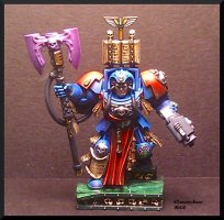
Thanks Suber! - i think the new background/light works better, inspired me to finish the first of the Space Hulk Terminators - C&C gratefully recieved as always.
 

Attachments

  • term1.JPG
    term1.JPG
    202.8 KB · Views: 930

Asslessman

Member
It looks really good, the transition are lovely, coudl use a little more edgelighting but we're getting on the personnal taste range here. they're superb. It's true those models are really nie and full f character. I really do prefer th eold shoulder pads which looked far less bulky than now and I would have loved more regular termies in the same poses (less decoration, are they boarding space hulks or attending the fashion week !) but once again, personnal taste here.
Have you planned painting other chapters?

Oh and yo ushould totally rename that thread, I can none of what it says in it ;)
 

clownshoe

Member
Thanks A-Man - much appreciated, the current Terminator has more blending and edge highlighting over the airbrush work so should "pop" more.
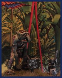
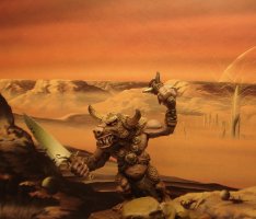
The idea of backgrounds has given my photography a much needed new lease of life. I am coming round to the idea that an average figure photographed superbly can "look" better than an awesome figure photographed poorly - and not in the obvious way like completely blurred or out of focus/dark etc. I think some of my photos previously were "too clear" and that some mood lighting and backgrounds can work miracles!!!
I am now quite proud of my minoutaur and very proud of old Hobol!
 

Attachments

  • hobol.jpg
    hobol.jpg
    173.3 KB · Views: 918
  • Minotaur - Copy.JPG
    Minotaur - Copy.JPG
    229.7 KB · Views: 918

Asslessman

Member
Wow, excellent pics here, Would yo umind me asking where you found those backdrops, I've been searching the wole interwebz for some cool oldschool backgrounds and never find anything as good as those, perhaps we should even have a thread t oshare those, anyway, whatever you have I'd gladly have :grin:
 

clownshoe

Member
The backdrops believe it or not are just fantasy art books - Heroic dreams by Nigel Suckling - Dreams - The Art of Boris Vallejo, Harry Harrison - Mechanismo and David A Hardy - Visions of space. If you have anything similar such as Patrick Woodroffe i am sure they would work. I am certainly going to be looking for more fantasy art books to utilize!
I actually spent an hour searching for my Woodroffe book in vain, i will have to get another copy - i've been fascinated by some of his work for many years, particularly this one.
e04365b3-5862-4db8-85b4-e9df22cc4cd3.jpg
 
I'm in agreement with Assless here, they aren't/were not awful in any sense of the word, and a lot of it is down to personal taste ( I also lean towards the plain termies, as impressive as the new Space Hulk guys are )

Also echoing what Snickit said, I tend to be my own worst critic so I sympathise when you're just not happy with something...I look at your gemstones ( well, pretty much the way everybody but me paints gemstones, actually ) and then at my attempts and can't help but feel a little dejected/ the need to improve.

Digging the backgrounds too, and that nugget of information about using a blue background is going to come in handy for me :ugeek:
 

clownshoe

Member
Some great advice for me in here, Protist - yours are outstanding. Nearly finished the Space Hulk Terminators now. I cannot recommend these figures enough - a real pleasure to paint and most satisfactory result (personally). I think i will be trying oil washes again. Something i trialed in the past with disastrous results.
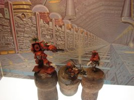
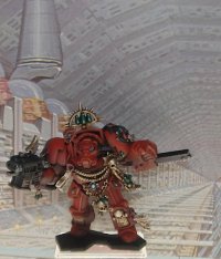
Here are a few snaps of the termies and the Librarian who goes on to be Mephiston. I am pleased with the marble effect on the base. I winged it a little but it worked out ok! I might even do a tutorial - it seems effective and quite easy if a little time consuming. C&C always appreciated.
 

Attachments

  • hulk.jpg
    hulk.jpg
    254.7 KB · Views: 836
  • small.jpg
    small.jpg
    216.2 KB · Views: 836
  • heavies.JPG
    heavies.JPG
    201 KB · Views: 836
Back
Top